

Everyone has a gray paint story. The chip looked calm and expensive. Then the north wall turned a chilly lavender, or the whole front went faintly green by noon.
That gap between chip and house is why the gray house is both the safest exterior choice and one of the easiest to get wrong. This guide gives you a method, nine palettes with reasons, and the small decisions that make a gray exterior look intentional.
Why gray keeps winning, and where it quietly goes wrong
Gray is a neutral with a personality. Pale versions feel breezy and coastal. Charcoals feel architectural and grounded.
It also gets along with brick, stone, wood, and metal roofs without a fight. That is a big part of its staying power.
The catch is that neutrals forgive nothing. With no bold color to distract the eye, every flaw shows: a wrong undertone, trim that is too close in value, a sheen that glares.
Most disappointing gray exteriors fail in one of three ways. The undertone fights something permanent. There is not enough contrast. Or the details have no point of view.
Start with undertone, not the color name
Every gray leans toward something. Cool grays tilt blue or violet. Warm grays tilt beige, brow,n or green. Greige sits between gray and beige.
Hold a sample against a plain white sheet of paper. The tint you notice first is the one you will see across the whole facade.
Next, look at what you cannot change: roof, brick, stone, driveway, window frames. Find their undertone and let the gray agree with it.
A cool blue-gray beside a warm tan roof will always feel slightly off. A warm gray beside that same roof looks settled.
Interior designer Jennifer Adams, answering a homeowner on the Better Homes and Gardens Real Estate site, suggests grays with brown or green undertones for a less common look. Her idea is a color where you hesitate between gray and green, or gray and brown.
For popular starting points, Edgecomb Gray (Benjamin Moore), Sea Salt (Sherwin-Williams) and Classic Silver (Behr) come up again and again. Treat them as places to begin, not answers. Sea Salt, for instance, leans noticeably green in many lights.
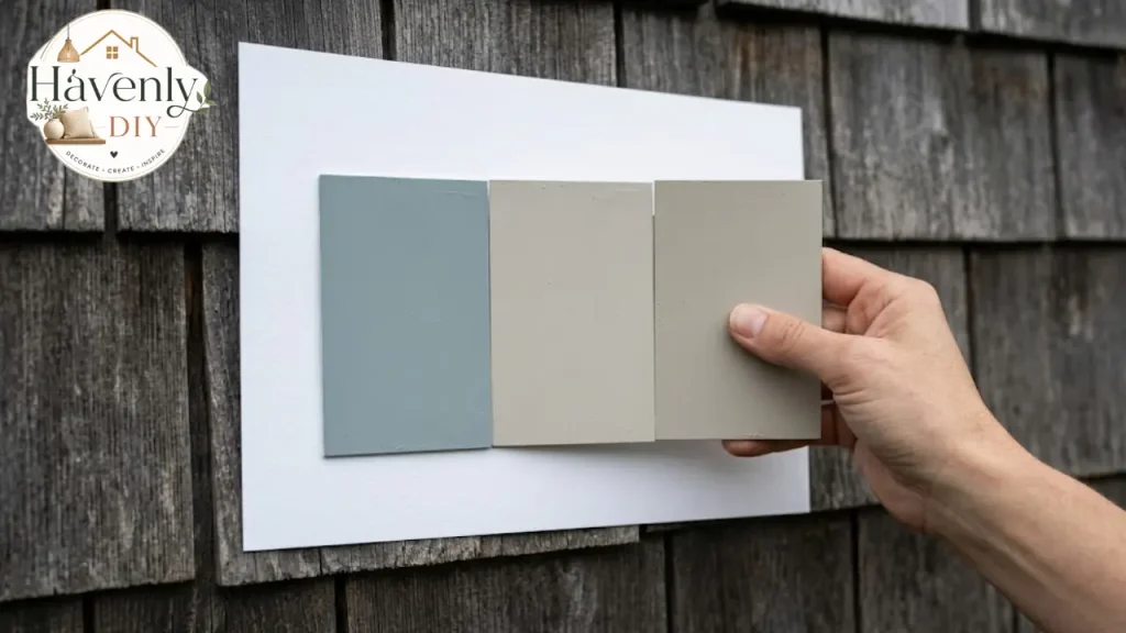
A quick way to read undertone on the wall
Put your sample beside something you know is a true neutral, such as a plain white card or a piece of unpainted white trim. Then ask what the gray seems to borrow.
If it looks slightly icy or purple, it is cool. If it reads sandy or toasty, it is warm. If it flickers between the two as the light moves, it is probably a greige, and that flicker is usually a good sign.
Squint at it. Squinting flattens detail and lets the dominant tint come forward. Many people only see the blue after the second coat, so test with a full-size patch rather than a thumbnail.
Compare in pairs. Look at two candidates side by side, glance away, then look back. The one that feels calmer after ten seconds is often the one you will live with.
Finally, judge the gray together with your trim and door samples. Colors behave differently as a group than they do alone.
Light does the rest
The same paint changes with direction and surroundings. North-facing walls get cool, even light and push grays toward blue. South and west light warms them and can wash pale grays toward cream.
Heavy tree cover pulls everything darker and greener. A gray that glows on a sunny corner lot can look muddy under oaks.
So test on the house. Paint large sample boards, at least two feet square, and tape them to the north, south, and shaded sides.
Check them at 8 a.m., noon,n and dusk, across at least two days. Include a cloudy one if you can. Never judge from a chip.
Also look at light reflectance value, or LRV, a 0 to 100 scale from black to white. Mid-range grays are generally the most forgiving. Very dark colors absorb more heat and tend to show fading and dust sooner.
One more painter’s habit worth borrowing: exterior color looks lighter in full sun than on a small chip. If you are torn between two shades, many painters nudge toward the slightly deeper one.
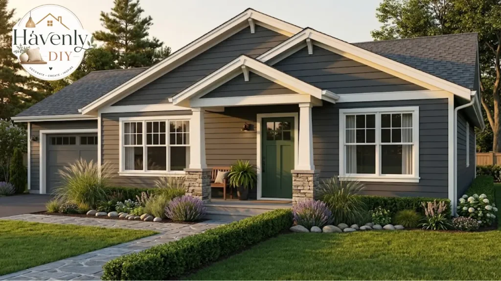
A sample-testing routine that actually holds up
Most regrets are avoidable with a week of patience. This is the routine painters commonly recommend, adapted for a homeowner.
Narrow to two or three grays. More than that and your eye stops being able to compare.
Paint each on a large board, two coats, so the backing never shows through.
Tape the boards to the north, south,th and shaded walls, with your trim and door samples beside them.
Look at them in morning, midday, day, and evening light, and once on an overcast or rainy day.
Step back to the street or the end of the driveway. A facade is judged from thirty feet, not three.
Hold a spare shingle, brick, brick, or stone next to each board so the fixed elements are in the picture.
Wait a day or two before deciding. Pick the one you still like after the novelty fades.
If none of them work, the fix is usually undertone rather than depth. Shift a little warmer or cooler, then test again.
Nine gray palettes and why they work
The combinations below are built around the trim, window, and door decisions that people actually struggle with. Verify exact paint codes with the manufacturer before ordering.
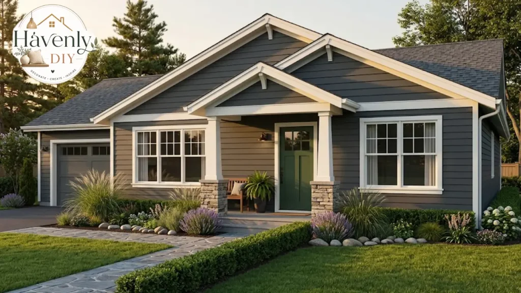
Soft gray, white trim, black shutters
This is the classic, and it earns that reputation. White trim sharpens architectural details and stops the facade from reading heavy.
Choose your white carefully. A paint-color consultant at The Color Concierge cautions against going too stark and uses softer whites such as Oyster White (SW 7637) for trim, fascia, and gutters.
Medium gray with black window frames
Black frames bring crisp, modern drama. They work best on simple forms with clean lines and generous glazing.
If your windows are already white, you can still get the effect with black trim boards around them or black accents elsewhere, such as shutters or a trellis.
Gray with warm cream trim
Cream softens the whole look and suits older houses, cottages, and anything with a porch. It is a gentler alternative when pure white feels hard.
Keep the cream clean rather than yellow. Hold a sample against the gray, not alone.
Charcoal on charcoal, with black trim
This is the moody option. Use a flatter finish on the body and a slightly glossier one on trim and shutters, so the details read without needing a second color.
One honest warning from HGTV: black trim can look yellow-green when spring pollen settles on it. In pollen-heavy regions, plan to hose it down.
Gray with navy accents
A navy door or shutters give gray depth without competing with it. A deep navy such as Hale Navy reads almost black in shade and unmistakably blue in sun.
This pairing suits coastal and traditional houses, and it is forgiving on brick bases.
Gray with deep green
Evergreen on a door, shutters, or porch ceiling adds a grounded, garden-friendly accent. It pulls the landscape up onto the house.
It works especially well with warmer grays that already carry a hint of green.
Greige with white trim
Greige colors, such as Agreeable Gray or Repose Gray, are the low-risk middle. They sit between cool and warm, so they adapt to changing light.
What they lack in drama they make up for in resilience. They suit homeowners who expect to sell in the next decade.
Layered grays
A medium cool gray on the siding, darker gray window frames, and white trim create depth without adding a new hue. Everything stays quiet, but nothing looks flat.
This approach suits modern farmhouses and Scandinavian-leaning exteriors.
Gray with natural wood and stone
A stained wood door, a fieldstone base or cedar details warm up a gray body. The texture does the work that color usually would.
This is the palette that photographs best, and it ages more gracefully than painted accents.
How to narrow nine palettes down to one
Nine options is a lot. Three questions usually cut the list quickly.
What are your fixed elements? Roof, brick, stone, a nd windows decide whether you lean warm or cool. Start there, and the list shrinks by half.
How much upkeep will you accept? Black trim and very dark bodies show dust and pollen. Mid-tones and greiges forgive more.
How long are you staying? If you may sell within a few years, soft gray or greige with white trim is the safe path. If you are staying, charcoal or layered grays reward the risk.
Whichever palette survives, run it through the sample routine above before you buy a gallon.
Match the gray to the house itself
Architecture should lead. A color that suits a modern box can feel wrong on a 1950s cottage.
Ranch homes are low and horizontal, so they handle medium and dark grays well, and they benefit from a contrasting door to add vertical interest. If you are working with one, our guide to ranch style homes covers form and detailing.
Farmhouse and board-and-batten suits warm whites, soft grays, and black accents. The vertical lines look good in two close tones.
Craftsman and cottage styles look best with deeper, warmer grays and cream or earthy trim, which bring out the woodwork.
Stucco and Spanish-influenced homes rarely suit cool slate. Warm, light grays with iron details sit better against clay roofs and arches. See Spanish-style homes for context on color and materials.
Additions and updates need special care. Matching new siding to old paint is harder than it looks, and a repaint of the whole facade usually solves it. Our piece on home additions covers how to blend old and new.
Whatever the style, if you want the gray house to feel considered, repeat one color from the roof, brick, or stone somewhere else on the facade.
Climate and surroundings change the answer
The same gray behaves differently depending on where the house sits. These are general patterns, not rules.
Humid and coastal areas. Pale to mid grays with white trim handle strong light well. Moisture makes prep and mildew-resistant finishes matter, so read the label.
Hot, sunny regions. A mid-tone body with abroaderr accent on the door tends to outlast a very dark body, which fades and heats up faster.
Cold, snowy regions. Warmer grays sit comfortably against white snow and short winter days. Very cool grays can feel icy.
Wooded or shaded lots. Shade pulls color darker and greener. Go a step lighter and slightly warmer than your instinct suggests.
Open, full-sun lots. Strong light washes color out, so a touch more depth often looks better in person than on the chip.
Roofs, brick and stone: the fixed elements
Black or charcoal roofs work with almost any gray. Brown or weathered cedar tones ask for a warmer gray, so the two do not argue.
A mid-gray roof needs a body color that is clearly lighter or darker, or the house blurs into one mass.
Red or orange brick calls for a gray with some warmth. Cool gray beside it makes both look wrong.
Natural stone pairs best with grays that carry brown or green. Pull the darkest tone in the stone for shutters or the door.
Do not forget the driveway. Concrete is usually a cool gray, so compare it with your sample too. Gutters and downspouts disappear when painted to match the trim or the body.
Doors, porch, and the small details
The front door is the cheapest place to add personality. On gray, deep blue, evergreen, warm wood,d and even a muted red,d all work. Black is safe and always looks sharp.
Porch ceilings deserve thought too. A pale, soft tone looks airy, and traditionally a haint blue or light gray adds a quiet touch.
Hardware and lighting complete the picture. Matte black, agedbronzen,ze and brushed brass all suit gray, but pick one and repeat it.
Landscaping finishes the job. White hydrangeas, boxwood and ornamental grasses make gray look intentional. If your entry needs rethinking, front porch ideas are a good place to start.
Sheen, materials and upkeep
Sheen changes how color reads. Satin is a common choice for siding because it resists dirt without glaring. Semi-gloss is typical for trim, doors, and shutters, since it wipes clean and defines edges.
Flat finishes hide surface flaws but can be harder to clean. Check the product label for what it recommends for your surface.
Painting brick is close to permanent, so be sure before you commit. If you want gray on brick, test small and consider the long-term upkeep.
Hot, sunny climates fade darker colors faster. If your house gets intense afternoon sun, a mid-tone gray often outlasts a very dark one.
Good prep matters more than the brand. Wash, scrape loose paint, caulk gaps, prime bare spots and then apply two coats.
Mistakes that make a gray exterior look flat
A few errors come up again and again:
- Skipping real sample boards and trusting the chip
- Ignoring the roof, brick, or stone undertone
- Choosing trim too close in value to the siding
- Copying a neighbor, which leaves you with a street of clones
- Adding too many accent colors
- Forgetting to check HOA rules before buying paint
The neighbor problem is more common than people admit. Adams’s advice to a homeowner in that spot was to change the undertone, use black accents, or switch from white to a warm cream, so the house stays distinct without breaking from the street.
If you are facing the gray house next door, a different undertone is the easiest way to stand apart.
Does the color matter at resale?
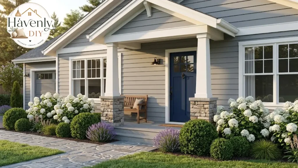
Neutral colors generally appeal to the widest range of buyers, which is part of gray’s reputation as the safe choice. Condition matters more than shade, though. Fresh, even paint with clean trim beats any trendy color on tired siding.
I am not quoting a resale percentage here, because figures vary by market and source. If you are selling soon, a local agent will know which tones sell in your neighborhood.
Drive the street before you decide. You are not trying to match your neighbors, but you do want to sit comfortably among them.
Bring the gray inside
An exterior does not stop at the front door. The interior palette should feel related, even if it is not identical.
Warm grays carry well into living spaces with wood and natural textiles. Cool grays suit crisp, minimal rooms. If you are mapping this out, our guide to interior home color combinations shows how to link spaces.
Pale grays also work well in coastal rooms, and our coastal kitchen ideas show how to keep them light. For warmer rooms, earthy bedroom ideas pair nicely with warm grays.
When you think about the gray house as a whole, the entry, the hallway,y and the main living space should share at least one color or material.
DIY or hire a pro?
A single-story house with good access and sound siding is realistic for a careful DIYer. Two stories, heavy prep, or steep rooflines are usually worth a professional.
If your home was built before 1978, test for lead paint before sanding or scraping. In the United States, contractors working on older homes must follow EPA lead-safe rules, and a homeowner should take the same care.
Follow the label for temperature and drying times. Most exterior paints specify a temperature range and a window of dry weather.
If you want to preview the result first, a design consultation or virtual interior design service can help you test ideas before you buy paint.
Choose the gray, then test it twice
The best exteriors are rarely the boldest. They come from patient testing, a clear sense of undertone, and a few well-chosen details.
Take your sample boards outside, look at them through a full day, and talk to your neighbors about what they chose. Then decide.
If you are still unsure where your taste lands, try the interior design style quiz first. Knowing your style makes choosing the right gray much easier, and the gray house you end up with will feel like yours.
FAQs:
What color trim goes with a gray house?
White or soft off-white is the classic choice. Black trim gives a modern, high-contrast look, and warm cream suits older or cottage-style homes. Match the trim’s undertone to the gray, and test it on the house.
What color front door looks best on a gray house?
Deep navy, evergreen, natural woo,d and black are the most dependable. A muted red or a warm yellow works if you want personality, ideally used on the door only.
Does gray exterior paint look blue?
It can. Cool grays lean blue, especially on north-facing walls. Test sample boards on every side of the house, at morning, noon and dusk, before buying.
Is dark gray a bad choice in a hot climate?
Not always, but very dark colors absorb more heat and tend to fade sooner. A mid-tone gray is often the more durable choice in intense sun.
What roof color goes with a gray house?
Match the undertone. Blac charcoallo,al and mid-gray roofs suit cool grays, and brown or weathered tones suit warm grays. Look at the roof sample beside the paint board, not separately.
What sheen should I use on gray siding?
Satin is a common choice for siding, with semi-gloss for trim and doors. Always confirm against the paint label for your surface.
Is gray still in style for houses?
Yes. Gray remains one of the most common exterior neutrals, and the trend has shifted toward warmer, greener, and darker versions with black accents.